
The Secret Sauce to a High-Performing Brochure
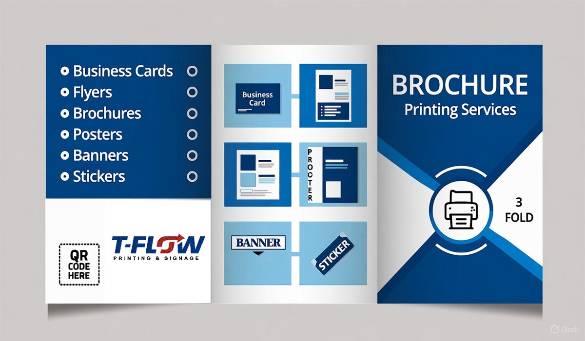
- T Flow Printing & Signage
- Western Canada
- October 6, 2025
In the world of marketing, trends change as quickly as the seasons — but one tool has quietly held its ground for decades: the brochure. Whether you’re promoting a grand opening, introducing new services, or simply reminding customers who you are, a well-crafted brochure can turn casual interest into genuine action. Yet not all brochures are created equal. Some are quickly discarded, while others linger on desks, travel in glove compartments, and even get pinned to bulletin boards. The difference? It’s what we like to call the secret sauce — the unseen blend of design, storytelling, and strategy that transforms paper into persuasion.
At T Flow Printing & Signage, we’ve spent years perfecting that balance. We’ve seen brochures that fail to connect because they say too much or too little, use the wrong colours, or forget the golden rule: make the reader care. The real magic begins when a brochure feels alive — when the texture, imagery, and message pull the reader into a story that’s as tangible as the paper it’s printed on.
The first ingredient of a high-performing brochure is clarity. Many businesses make the mistake of trying to tell their entire life story in three panels. But a great brochure isn’t about telling everything — it’s about telling what matters most. It should answer three key questions instantly: Who are you? What do you offer? Why should I care? When those answers come through clearly, you don’t just inform your audience — you invite them to act.
The next part of the secret sauce is visual rhythm. Brochures are physical journeys; readers move through them panel by panel, and every fold reveals a new moment. The layout should guide the eyes naturally, with headlines that breathe and images that evoke emotion. A clean design with strong contrasts and readable typography is essential. Think of it like choreography — each element, from icons to margins, should move in harmony. A cluttered brochure feels like noise, but a well-paced one feels like music.
Then comes texture and finish, the tactile details that separate an ordinary handout from a keepsake. The choice of paper weight, matte versus gloss, and the subtle use of spot UV or embossing can instantly elevate perception. When your brochure feels premium, your brand feels premium. This isn’t about extravagance — it’s about signaling quality through the senses. The best print marketing doesn’t just speak to the eyes; it speaks to the fingertips.
But even the most visually stunning brochure will fall flat without compelling storytelling. Great brochures speak the language of benefits, not features. They don’t just say “we offer fast service” — they say “your time matters, and we make sure you get it back.” They don’t say “we’ve been in business 20 years” — they say “for 20 years, our customers have trusted us to get it right.” The tone should feel human, conversational, and authentic. It’s not about shouting louder — it’s about connecting deeper.
Another overlooked ingredient is strategic placement. A brochure’s power doesn’t end when it leaves the press. It thrives when it lands in the right hands — at trade shows, waiting rooms, checkout counters, or bundled in mail campaigns. The right distribution strategy ensures your investment pays off. At T Flow, we help clients plan where and how to share their brochures, because print is most powerful when it meets people in the real world — not when it gathers dust in a storage box.
And let’s not forget branding consistency. A brochure should feel like it belongs to your company’s identity — the same colours, tone, and message seen across your website, signage, and social media. It’s not just paper; it’s a physical extension of your digital presence. Every logo placement, tagline, and call-to-action should reinforce your brand story. When customers see your brochure, they should immediately know it’s you — even before they read a single word.
Finally, the secret sauce includes something less tangible but equally vital: emotion. Whether it’s excitement, trust, curiosity, or nostalgia, emotion drives engagement. The best brochures make people feel something — and when they do, they remember you. Maybe it’s the photo of a happy family, the warm colour palette, or a powerful headline that hits home. Whatever it is, emotion is the bridge between your brand and your audience’s heart.
In a digital-first world, it’s tempting to think that print has lost its relevance. But in truth, it’s more important than ever. When everything else exists in pixels, a brochure offers something rare — something people can touch, hold, and keep. It feels personal. It feels real. It feels permanent. And that permanence builds credibility in a way no email ever can.
That’s why the most successful modern marketing strategies don’t abandon print — they integrate it. A brochure can drive readers to scan a QR code, visit your website, follow your social media, or even watch a personalized video. At T Flow Printing & Signage, we blend print craftsmanship with digital innovation, creating brochures that don’t just inform — they perform.
So, what’s the secret sauce to a high-performing brochure? It’s not a single element. It’s the fusion of message, design, texture, and purpose — all working together to make a lasting impression. It’s art meeting strategy, ink meeting intention, and paper meeting passion.
If you’re ready to create a brochure that tells your story beautifully and drives real results, we’re here to help. Let’s turn your ideas into something unforgettable — because your brand deserves more than just ink on paper.
Visit T Flow Printing & Signage today and discover how the right print can transform your message into momentum. Connect with us on Facebook to see our latest work, design tips, and behind-the-scenes inspiration.
At T Flow, we don’t just print brochures — we craft experiences.


