
The Psychology Behind Real Estate Sign Colors
- T Flow Printing & Signage
- Western Canada
- November 3, 2025
Color is not decoration in real estate — it’s persuasion. The moment a potential buyer turns onto a street, colour cues begin shaping expectations long before a foot ever hits the sidewalk. Real estate agents know it. Developers know it. And the signage industry has been studying it for decades. Signs don’t simply say “For Sale.” They whisper “trust us,” “look closer,” “you belong here.” That is the psychology behind real estate sign colours, and why the right palette can turn casual interest into confident action.
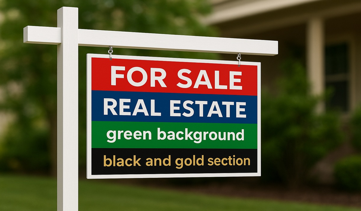
Red has always been the loudest voice in the room, and in property marketing, it’s the colour that grabs attention fastest. It signals urgency, energy, and movement — the emotional promise of opportunity. It’s the reason so many luxury brands and restaurant chains use it: people simply can’t ignore it. A red-accented real estate sign communicates that something is happening here. It nudges passersby to stop scrolling, slow the car, or take a second glance. But red requires balance; too much and it becomes aggressive, even stressful. When paired with clean whites or deep neutral tones, it becomes what it was meant to be — a confident handshake, not a shout.
Blue, on the other hand, is reassurance in colour form. It speaks of stability, trust, and professionalism, which is why major banks and financial firms wrap themselves in its hues. In real estate, blue signals a calm and credible transaction, making it ideal for brokerages focused on reliability and long-term relationships. When a sign uses navy or cool sapphire accents, the subconscious impression is clear: these people know what they’re doing, and they’ll take care of you. Blue is for the buyer who values competence over flash, and for the seller who wants to project dependability.
Green brings another emotional language altogether — growth, prosperity, and the comfort of home. In suburban neighbourhoods or natural settings, green has a powerful grounding effect, tapping into the human instinct for safety and environment. Buyers associate it with stability, health, and balance. It also carries a subtle message of modernity and sustainability. When a brokerage leans into green, they are quietly aligning themselves with responsible development and forward-thinking lifestyles. It feels fresh, secure, and connected to life’s long-term chapters.
Black and gold are the luxury signals. There is an immediate sophistication to deep black contrasted with refined metallic tones. It suggests exclusivity, privacy, and premium value — not just in price, but experience. These colours tell buyers that the property — and the representation behind it — is selective. In affluent markets, this matters. People don’t just buy a home; they invest in a story, a reflection of self. Black-gold signage doesn’t simply promote a listing, it elevates its perceived status. That’s why luxury agents return to this palette again and again — it frames a property the same way a velvet tray frames a diamond.
White plays a quieter but essential role. Some signs drown in clutter; white offers clarity, space, and breath. It suggests simplicity and honesty. When white is the dominant colour, it communicates transparency and openness — a “nothing to hide” confidence. In busy environments, a white-forward sign can be the most striking because it calms the visual field. It makes the message crisp, legible, and elegant without trying too hard. More importantly, it directs the viewer’s eye precisely where it needs to go: the agent’s information and the property itself.
Yellow is the optimist. It’s cheerful, bright, and psychologically linked to optimism and energy. Used sparingly, yellow accents spark curiosity and warmth. They’re especially effective in markets targeting young families, first-time buyers, or revitalized neighbourhoods buzzing with growth. Yellow tells buyers that possibility lives here — that this is a place to build memories and beginnings. But like red, moderation is key. Too heavy a hand and it risks appearing gimmicky or overwhelming. When done properly, it creates a feeling of welcome and vibrancy nothing else achieves.
Every colour triggers emotion. That is the science. But the art is in applying it strategically — matching colour to community, property type, brand identity, and buyer psychology. A downtown penthouse doesn’t speak the same visual language as a lakeside cottage. A historic neighbourhood has different emotional cues than a modern urban development. The best real estate professionals understand their market, then let colour do what it’s designed to do: influence without ever saying a word.
For real estate professionals, the goal isn’t simply to match a brand to a colour; it’s to align a feeling with a future buyer. People make emotional decisions first and rational ones second. The right colour combination primes the emotional response long before the brochure is opened or the virtual tour begins. In a competitive market, this edge matters. It shapes perception, increases trust, and positions a property in the buyer’s mind before a single conversation happens.
And that’s where great signage companies step in. They translate psychology into design — brushstrokes, tones, finishes, contrast, and texture. A sign isn’t a print job; it’s a sales tool. Durable materials, UV-resistant finishes, clean typography, and colour accuracy all contribute to how a listing performs on the street. When a sign is thoughtfully produced, it becomes a silent agent working 24 hours a day.
T Flow Printing & Signage understands that in property marketing, visuals aren’t optional — they are strategy. Whether it’s a bold urban sign that demands attention or a clean minimalist design that builds trust, the goal is always impact. Every sign that leaves the shop is created with the same purpose: helping real estate professionals stand out, connect, and convert curiosity into offers. Because in real estate, visibility is opportunity, and the right colours make that opportunity impossible to ignore.
If you’re building your brand, planning your next listing, or ready to refresh your signage, working with a team that understands both printing and psychology gives you the advantage. Elevate your presence, sharpen your message, and let your signs do the speaking before you even arrive.
To stay connected with future updates, creative inspiration, and behind-the-scenes looks at premium real estate branding, follow T Flow here: https://www.facebook.com/profile.php?id=61561452777281
In an industry built on first impressions, the right colours don’t decorate — they perform. And in a market where every glance counts, performance is everything.


