
The Psychology Behind Real Estate Colours
- T Flow Printing & Signage
- Western Canada
- September 29, 2025

Walk down any street with “For Sale” signs and you’ll notice something right away: colours speak louder than words. A splash of red grabs attention, a deep blue inspires trust, and a bold yellow can make a passerby stop and look twice. In real estate, colour isn’t just decoration—it’s psychology at work. Whether on a yard sign, a banner, or inside a staged home, the shades you choose have a direct impact on how buyers feel, act, and ultimately decide.
In real estate, decisions are often made in seconds. A potential buyer scrolling through listings or driving by an open house isn’t analysing the details of typography or layout. They’re reacting, almost instinctively, to the visual cues before them. This is where colour takes centre stage. It’s a silent language, guiding emotions, shaping perceptions, and nudging behaviour in subtle but powerful ways.
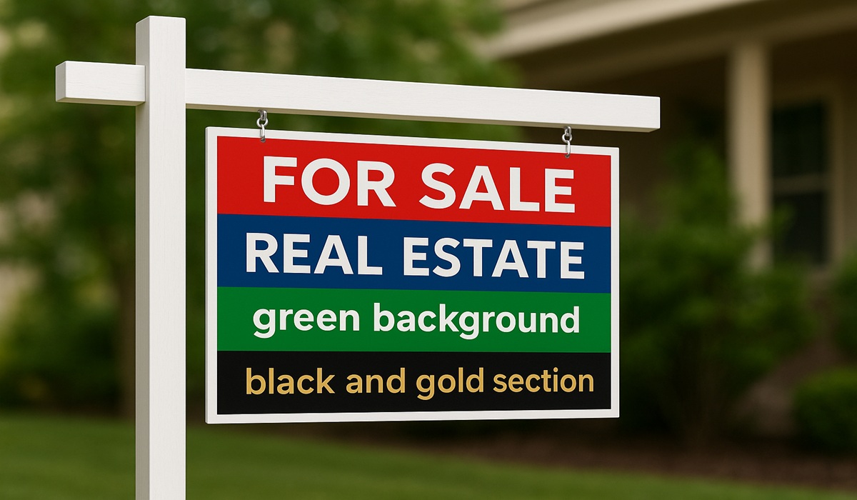
There’s a reason “SOLD” signs are almost always red. Red conveys urgency, importance, and power. It’s the colour that says, “Look at me now.” For real estate agents, incorporating red into signage can help draw eyes to critical information—contact details, an open house date, or that all-important “For Sale” notice. But there’s balance to strike. Too much red can feel aggressive, almost pushy. Used sparingly, it becomes a powerful tool.
If red sparks action, blue builds trust. Real estate is a business built on relationships, and buyers need to feel confident in both the agent and the property. Deep blues communicate stability, dependability, and calm. They suggest professionalism and sincerity, making them ideal for brokerage branding or informational signage. Think of blue as the steady hand in the chaos of property transactions—it reassures people they’re making a sound choice.
Green is a natural fit for real estate. It represents life, growth, and prosperity. For suburban properties with lush lawns or rural homes with acreage, green ties the property to its environment. Psychologically, it connects to feelings of wealth and balance, which is why many luxury signs incorporate darker shades of green. It also suggests eco-friendliness—an increasingly important factor for buyers conscious about sustainability.
While not technically colours, black and white are foundational in real estate branding. Black communicates authority and sophistication. A black sign with bold white text is hard to ignore and suggests exclusivity. White, on the other hand, provides clarity, space, and cleanliness. When combined, black and white create contrast that demands attention while remaining timeless and professional.
Yellow is cheerful, energising, and full of possibility. It’s the colour of new beginnings, which makes it a clever choice for open houses and “coming soon” signs. But as with red, moderation matters. Too much yellow can overwhelm and strain the eye. When used thoughtfully—as an accent border or highlight—it can brighten up a sign and spark curiosity in potential buyers.
Colour in real estate isn’t about decoration—it’s about guiding people through a journey. At first glance, the right shade captures attention. As they linger, colour creates an emotional connection, setting the stage for trust, excitement, or reassurance. Finally, when it’s time to act—schedule a showing, call an agent, or sign on the dotted line—colour has already done the invisible work of persuasion.
This journey plays out not only on signage but in marketing materials, staging, and even digital platforms. A brochure with muted earth tones feels warm and approachable. A website with bold blues and crisp whites feels professional and efficient. A staged home with soft greys and inviting accent walls signals modern elegance. Each decision influences the subconscious, even if buyers aren’t aware of it.
Understanding colour psychology is one thing, but executing it properly requires expertise. The wrong shade of red can look cheap; a poorly printed blue can lose its richness. This is where professional printing and signage make the difference. At T Flow Printing & Signage, we know how to match design with psychology, creating pieces that don’t just look good—they work.
Whether you need bold lawn signs that catch attention from a block away or polished brochures that reflect your professionalism, the right colour choices combined with high-quality printing are essential. Real estate is competitive. A sign that fades in the sun or a flyer with dull colours isn’t just unprofessional—it’s a lost opportunity.
Our team ensures that every print captures the depth, vibrancy, and emotion intended. From UV-protected outdoor signs to premium indoor displays, we bring your branding to life in a way that buyers feel before they even step inside the property.
Real estate is not just about selling one property—it’s about building a brand that clients remember and return to. Consistency in colour is key to this. Using the same shades across all your signage, marketing, and digital presence reinforces recognition. Over time, those colours become synonymous with your professionalism, trustworthiness, and results.
At T Flow Printing & Signage, we help you establish and maintain that consistency. By providing not only printing services but also design guidance rooted in psychology, we ensure your brand stands out in a crowded market.
When buyers are choosing between listings, the decision often comes down to intangibles—the feelings a property stirs up. Colours play an enormous role in creating those feelings. They can make a modest home feel luxurious, a fixer-upper feel full of promise, or a high-end listing feel even more exclusive.
The psychology of colour isn’t a gimmick—it’s a proven tool. Real estate agents who understand it and leverage it gain an edge in a highly competitive field. And when paired with expert printing and signage, that edge becomes a powerful advantage.
In real estate, first impressions matter. The colours you choose for your signs, brochures, and marketing materials are more than aesthetics—they’re psychology at work. They influence perception, inspire action, and build trust.
At T Flow Printing & Signage, we understand that every shade, every detail, every print job matters. Because when it comes to real estate, the right colours don’t just decorate—they sell.
Stay connected with us on Facebook and discover how the right colours, paired with quality printing, can transform your next listing into a sold sign.


